Built for the fan: Redesigning Ticketmaster's fan-first experience
- Ticketmaster

- Apr 5
- 5 min read
Updated: Apr 14
ROLE
Design Lead
DURATION
2 years
SERVICES
Strategy, Stakeholder Interviews, Competitive Analysis, Journey Mapping, UX, Wireframes, Mockups, User Research, Design systems, Prototypes, Design ops, User Research, A/B Testing

CHALLENGE
Ticketmaster's purely transactional product was losing ground to Amazon, Airbnb, StubHub, and SeatGeek, all investing in richer event experiences, while internal design fragmentation was silently compounding the problem.
STRATEGY
I led end-to-end experience design across the fan journey, from event discovery through post purchase, while simultaneously rebuilding the fractured design system that had to support it all.
IMPACT
Delivered a comprehensive product vision spanning discovery, seat selection, group purchasing, and mobile ticketing, earned direct executive recognition, and established the Nucleus design system as a scalable foundation across Ticketmaster's feature teams.
CHALLENGE
A transactional brand in a relationship-driven market
The live events ticketing landscape had grown fiercely competitive. Amazon and Airbnb were investing in enriching the end-to-end event-going experience, while StubHub and SeatGeek continued expanding their market share. Ticketmaster understood that a purely transactional product was no longer a defensible position. The business goals were clear: increase return visits, improve engagement, and ultimately boost conversion rate. The brand needed to evolve from ticket vendor to fan platform.
The data sharpened the focus.
The average Ticketmaster customer bought just 1.2 tickets per year, but a distinct segment internally called "Live Event Junkies" attended 4.2 events.
That audience represented the real long-term conversion opportunity, and the existing product did nothing to cultivate them.
Compounding the product challenge was a structural one. Ticketmaster's digital experiences were built by siloed feature teams with no shared governance over design. Designers had begun forking their own versions of the global style guide, each updated locally with no change log and no visibility across the org. What had been intended as a living document had become a source of inconsistency and technical debt.


STRATEGY
Embed, align, and move fast
I worked on-site directly with Ticketmaster's Marketplace and Enterprise Design Teams. The engagement required regular sync-ups with internal product owners, in-house and offshore engineers, and executive stakeholders. Before starting screen based design, I ran white boarding sessions to establish content requirements and responsive layout behaviors across desktop and mobile, then used product design tools to translate those foundations into high-fidelity wireframes with component logic throughout.


Mapping the fan journey from the ground up
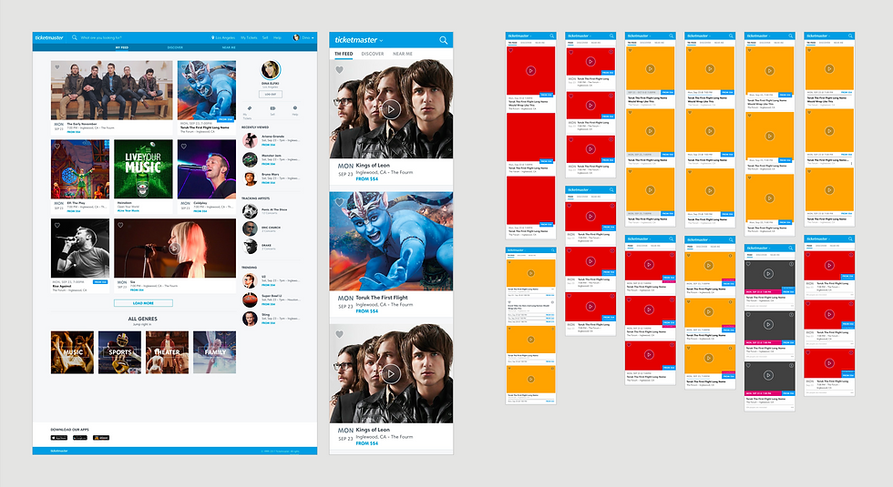
I collected behavioral data from Ticketmaster data specialists and journey mapped the most common paths across key fan types. Those journeys surfaced a consistent pattern: users loved shortcuts to the Artist Detail Page and Event Detail Page, and the existing homepage buried them. We exposed those entry points with a single click on the homepage.

From there I owned the exploration for the desired discovery experience, centering it on helping fans find an event and convert to the Event Detail Page where seat selection happens. The event cards are the highest touchpoint component on the homepage, we optimized and balanced high-impact artist visual content with critical event information. Design was validated with A/B testing with internal coffee sessions and A/B testing with a subset of live consumers.
Designing the end-to-end fan experience
The scope of the product work covered the full fan journey:
Event discovery was redesigned to surface personalized recommendations and engaging editorial content, moving the experience away from a static browse grid toward something that felt curated to the fan.

Seat comparison introduced a new calendar component that let users compare pricing and availability across multiple dates directly on top of the Event Detail Page. The component was optimized by genre, with distinct layouts tuned for Music, Sports, and Arts and Theatre.

Group purchasing introduced a dedicated group landing page where friends could split purchases and find seats together, a meaningful expansion of the social dimension of live events.

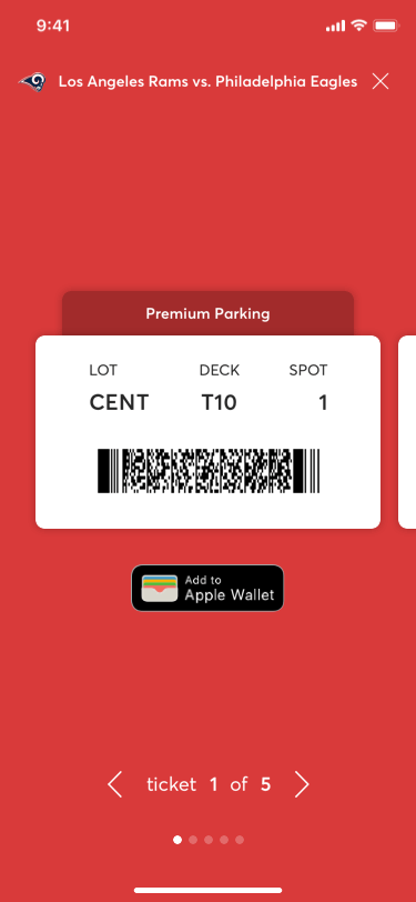
Mobile ticketing required solving for a hierarchy of ticket types that had to be immediately usable to both fans and venue attendants. Parking tickets required the highest visibility since users typically present them from their car. Food, beverage, and VIP tickets needed clear differentiation from standard adult tickets. The redesign made those distinctions unambiguous under real-world conditions.
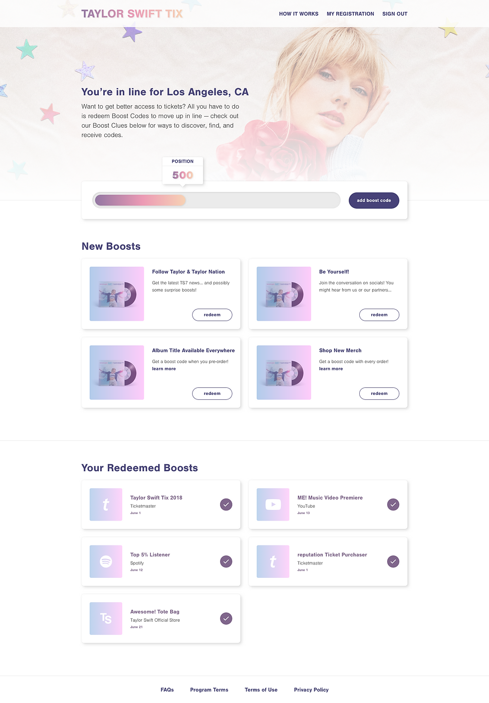
Post Purchase tackled one of the industry's most persistent problems: high-demand events where bots had made fair access nearly impossible. The product created a new purchase model for those situations. Fans earned position in the purchase queue by completing "Boosts" such as watching a documentary or streaming a new single, with more boosts translating to better queue placement and a better shot at tickets.

Validating with the fans who matter most
To pressure-test the work, Ticketmaster's Verified Fans were invited into bi-weekly focus groups and user testing sessions. I ran those sessions alongside a product owner for the seat selection experience, documenting feedback, identifying themes, and applying learnings into the designs for each subsequent round. I also led heuristic workshops and lunch-and-learn sessions to build shared design literacy across the broader team.
Rebuilding Nucleus in parallel
While the product work moved forward, the design system needed urgent attention. I conducted a full audit of Nucleus v1 and v2, mapping each element to feature teams and release dates to understand how the fragmentation had accumulated. That produced two parallel workstreams: updates to legacy versions and a forward push toward Nucleus v3.


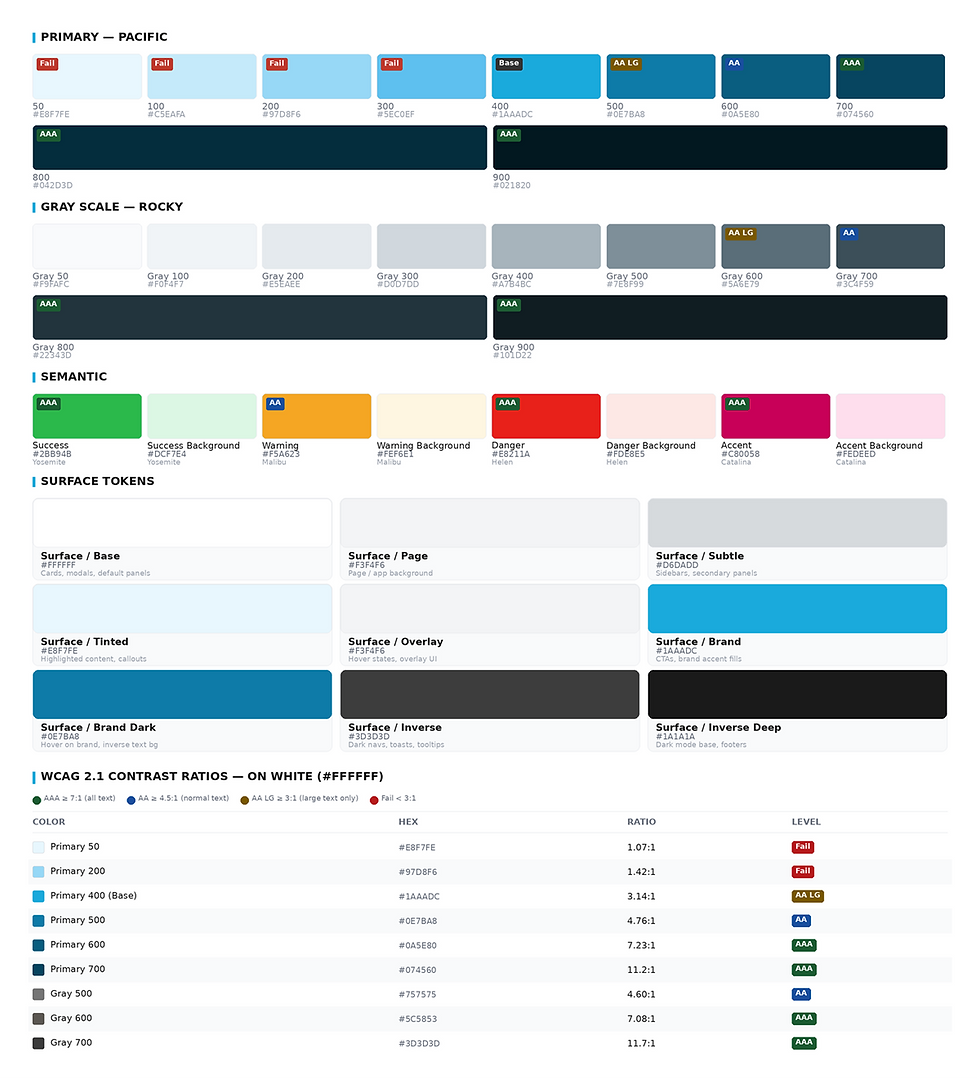
The immediate fixes addressed accessibility and legibility. Color palettes were updated to meet ADA requirements, typography was overhauled for readability and tone, iconography was modernized and migrated to icon fonts for performance, and layouts were optimized for content density.
The longer-term work was cultural as much as visual. I established a governance model including: peer validation processes, nominated key holders responsible for maintaining the master style guide, and ran workshops to build team fluency in the tools sustaining it, including Slack for change documentation and InVision for shared asset libraries. The entire visual design system was converted from sticker sheet format to a comprehensive atomic structure, which made the eventual transition to React Storybook significantly smoother and began closing the gap between design and development.
Giving internal designers a genuine voice in shaping the pattern library was a deliberate strategy. Their ownership of it was the only thing that would make it last after the engagement ended.
I brought a design ops lens to the engagement, evaluating team performance and recommending promotions and structural changes to improve how the team functioned.
"I'm very happy with the work... the level of thinking, the commitment to our brand traits, and the finesse and polish that is making the work shine. Again, thank you." Jason Giles VP Design, Ticketmaster North America
RESULTS

Revenue
$38M estimated revenue (+4%)

Revenue Per User
$10 increase in revenue per user (+30%)

User Sign-in Rate
75% User sign in rate (+33%)


